Behind the Scenes of Our Ferguson Virtual Renovation
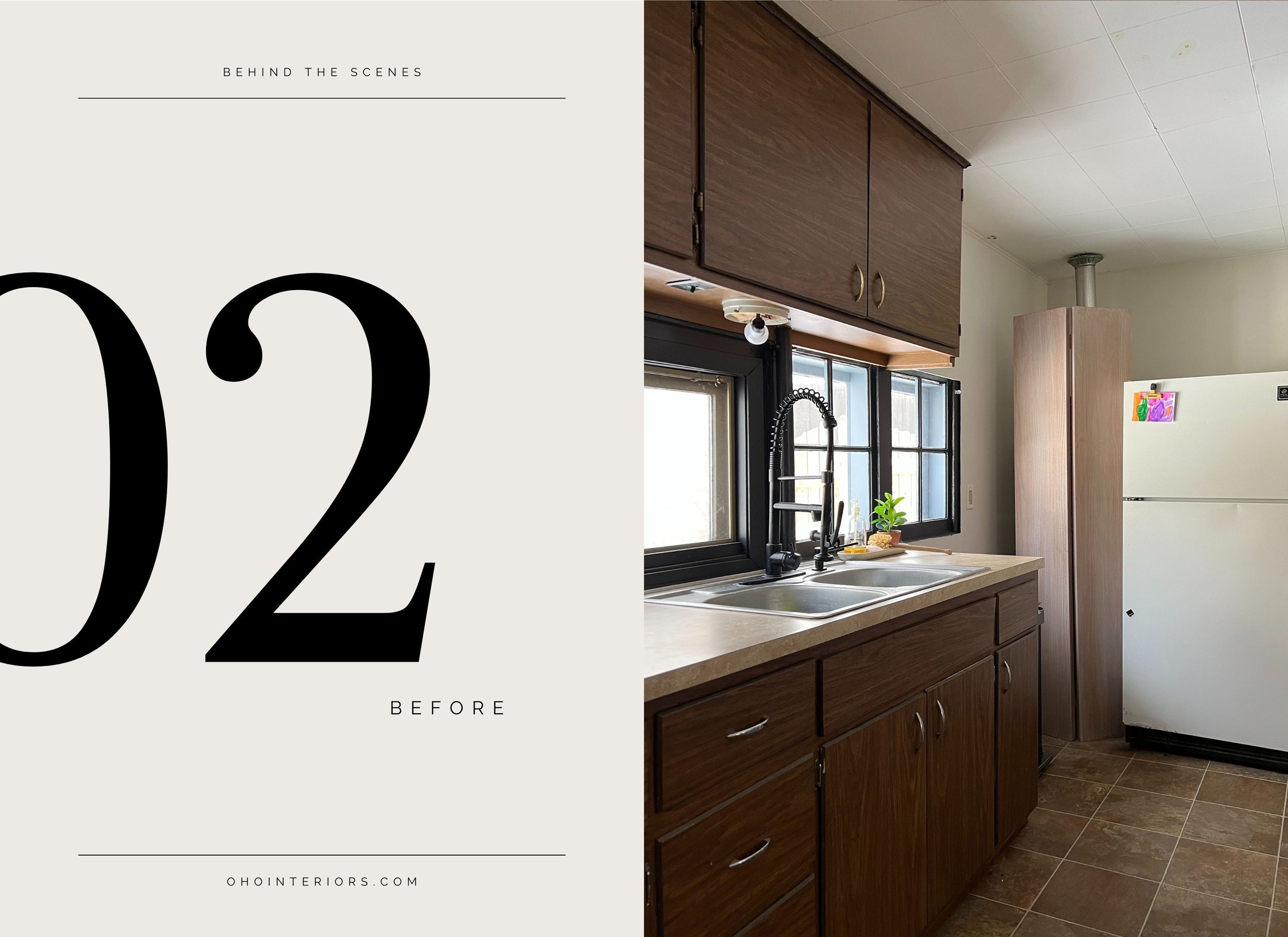
One of the most fulfilling pieces of having a career as an interior designer is that we truly get to have a before and after moment to look back on and reminisce over. To be able to look at an image of any given space and reflect on the work, communication and heart that goes into each and every one of our before and after images truly is one of the most surprising and tangibly rewarding aspects of a project.
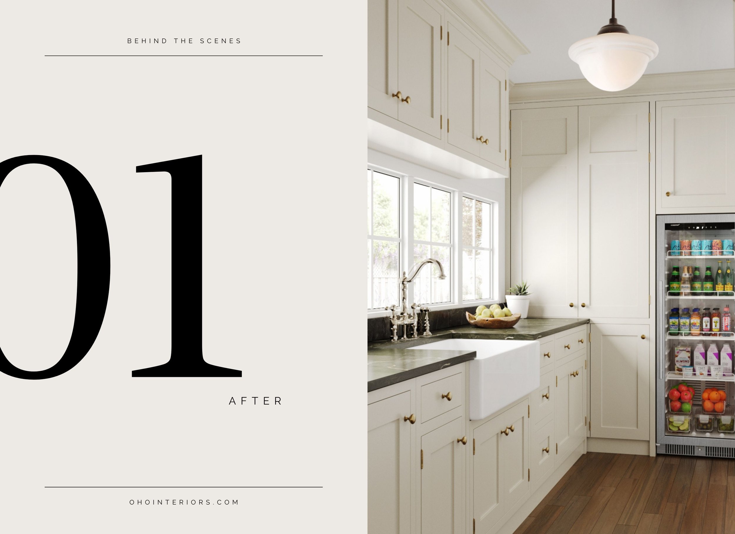
We’ve been working for months, with the amazing team at Ferguson, on a virtual renovation of one of the last remaining spaces left untouched at Oho Cottage - the Guest House Kitchen. It’s been an emotional collaboration, as our move to Colorado looms dangerously close on the calendar, but one that truly feels like it closes the loop on the story of this house. Being able to see this space that we were never able to renovate ourselves reimagined through digital renderings has been such a gift. And going through the process of designing this space in fullness has allowed us to develop a design plan to pass along to the next owner’s of this house that both will fully speak to the work that has been done in the main house and also allow a little bit more of Oho’s signature design style to live on at Oho Cottage.
Today we thought we would bring you a Behind the Scenes look at how Oho’s internal processes integrated with the Ferguson team’s virtual renovation process and why our partnership on this project was such a natural one.
Visual Direction & Selections
Each and every Oho project begins with inspiration image gathering, no matter the scale or location. This project was no different and, as we gathered images, a common visual theme for the kitchen really started to reveal itself. Mushroom cabinets and soapstone counters really took center stage with the vast majority of our collected imagery had the same elements.
After setting our visual direction with inspiration images, we always leap into the finish & fixture selection stage. With the team at Ferguson taking care of many of the technical elements of the project, that left us to truly enjoy picking electrical and plumbing fixtures, appliances and hardware that fit the vision. Our first stop, with almost every project, is Build.com where we can filter, search and narrow down to our heart’s content and start curating a selection of finishes from our favorite brands that feel cohesive and elevated.
For this specific project we sourced from some of our tried and true brands that we know and love and added in some new-to-us brands that gave us exactly what we needed visually at a price point that is hard to compete with.
One of the challenges of this particular kitchen is it’s small footprint. We needed every item to pack a lot of function in it’s designated space while still living up to the Oho aesthetic and the biggest win in that category truly was the Edgestar 22” fridge. Edgestar’s products have a focus on portability and innovative use of small space, while being a leader in quality & customer support. Because this was for our Guest House, we didn’t actually need the function of a standard size fridge due to the short-term stays of it’s visitors and the visuals of the glass door were an asset to this particular application as this fridge would house mostly beverages and snacks for our visitors and also preform double-duty in keeping a wall of cabinetry feeling light and airy.
Our hero shot definitely is that Signature Hardware Bridge Faucet with its views into the backyard and the Polished Nickel finish adds a fresh feel to the Old World detailing. Not only are Signature Hardware products beautiful & built to last but they also have complementary pot fillers, sinks and even soap dispensers to achieve a beautifully crafted look.
The polished nickel plumbing fixture also pairs beautifully with the rubbed bronze metal finish of our Millennium Lighting light fixture which, similar to other Millennium light fixtures, feels unique & timeless for any space.
Finishing off the space with the Amerock Mushroom Knob & Inset Cabinet Hinges which allowed us to mix metals in an intentional and designed way. We love that Amerock’s finishes are designed to coordinate with plumbing fixtures and other home decor elements to truly achieve a cohesive & bespoke look.
Digital Mood Board & Digital Rendering Delivery
Once we had our finishes fully selected, the team at Ferguson created a digital mood board for us to make sure we were in alignment with the final feel of the space which led us to this moment, where the cherry on top really is seeing the Kitchen reimagined as we always hoped it could be but before a single hammer was ever swung.


